
It is almost universally held that the full impact of the interest rate increases experienced to date (let alone those which may be yet to come), are yet to be felt. Economic theory holds that the impact may lag by up to 18 months. Signs of the impact may include rising unemployment, falling retail sales, falling consumer and business sentiment and falling asset prices to name a few. The outcome of these signs is what reserve banks desire: falling inflation. To put this in perspective, the last annualised inflation reading for Australia was 7.8% and the target is 2%-3%.
The chart below is quite dramatic and puts in into some recent historical perspective. You can see why reserve banks are fearful of inflation getting out of hand. It’s a similar story globally and heads of reserve banks are all singing from the same hymn book.
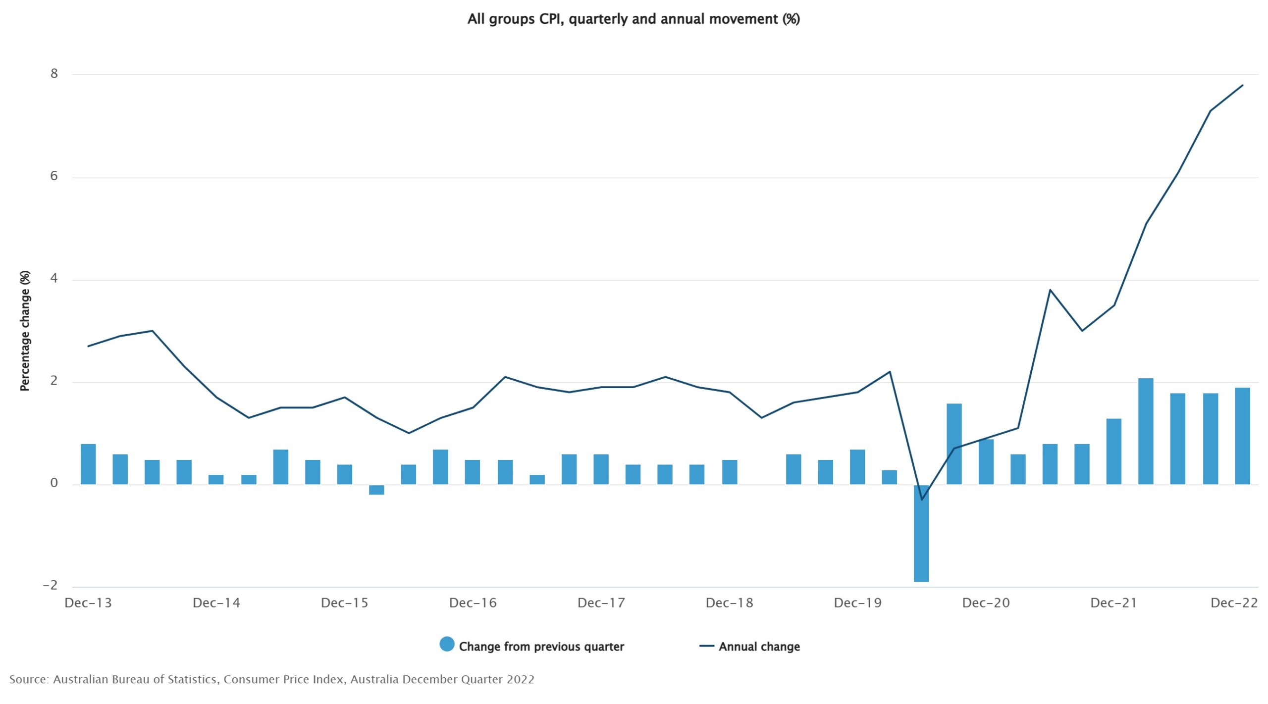
The pace of rate rises is enough to give you a nosebleed and, along with the rapidly rising cost of living, many are crying out in budgetary pain and fear of recession. Little wonder the prevailing view is one of pessimism and, when it comes to asset values, predictions of further falls to come.
But when almost everyone expects the same thing, perhaps it’s worth thinking: what if almost everyone is wrong? After all, it wasn’t so long ago that almost everyone held the view that interest would be lower for longer.
Quay Global Investors has provided 10 charts for optimism which you can read here: Investment Perspectives: 10 charts for optimism in 2023 | Quay Global Investors